
On 26/05/07, Lists In@IDC listsin@integrateddevcorp.com wrote:
On May 25, 2007, at 7:47 PM, Cliff Pruitt wrote:
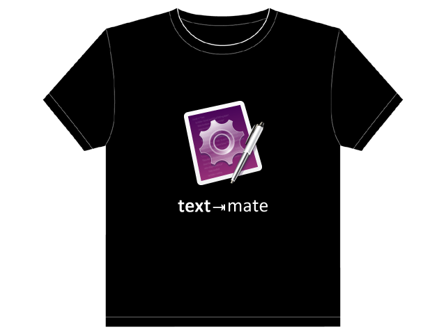
I'm not too big on the Text ⇥ Mate thing... The app name is TextMate. Breaking the name up seems weird. Granted the tab triggers are a core part of the app, but I'm not sure it makes a good shirt.
My vote is still for the app icon & the name. Let it be as elegant as the app itself. The rest is starting to sound like tee-shirts college students wear on spring break ("My Bundle is bigger than yours...").
Whatever... just my $0.02
I agree.
Minimalist, out of your face approach; just like the product.
Less is more.
I definitely want it clean and simple, too, though that doesn't necessarily imply the lack of a slogan/suchlike.
I made clean-and-simple (in my opinion) mockups of just the logo and "textmate", and the same with "text⇥mate". I actually think I'd prefer the latter after seeing it "in action". Just one character away from full simplicity, but adds a lot of spice.
The PSD (Adobe Photoshop) is at http://henrik.nyh.se/dump/TextMate%20shirt.psd (0.5 MB) if someone else wants to play. Used Calibri for the font (very close but not quite what's used on http://macromates.com/, it seems). The t-shirt graphic itself is from some "make your own t-shirt" site.