
19 Mar
2006
19 Mar
'06
10:03 p.m.
Hey Thomas,
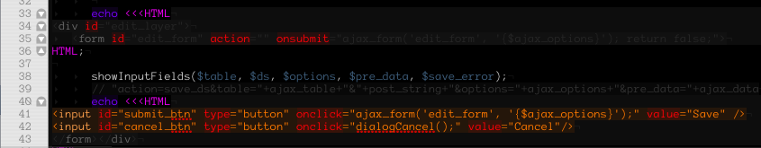
you're on a theming spree. (Imagine that in the voice of the quake announcer). It looks good and meets my taste in general, high contrast on black bg. Here is a screenshot with a little problem though:
The Heredoc stuff is hardly readable and the comments could maybe get a little more contrast, too.
Cheers, Stan aka Soryu.
PS: I'm kind of working on a new theme, too, so watch it :)